It started with a simple thought: why are power sockets always so boring?
They’re everywhere—on every wall, in every room—yet we’re trained to ignore them. Neutral, anonymous, purely functional. I wanted to challenge that idea and turn something ordinary into a small but meaningful design detail—something that could add personality rather than disappear into the background.
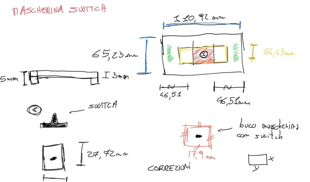
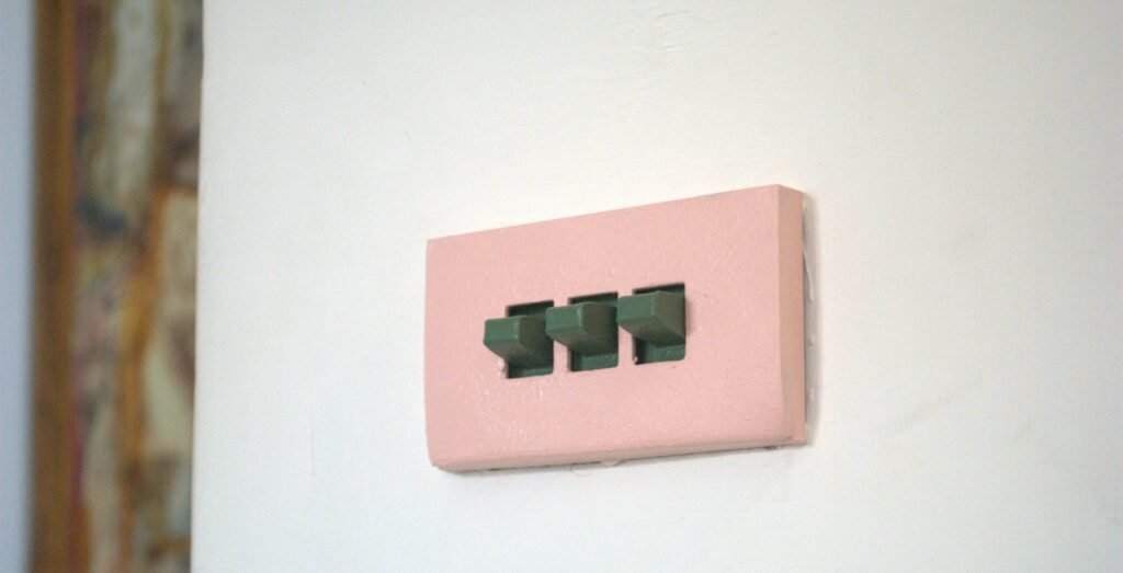
The journey began in Blender. I explored shapes, proportions, and small geometric variations, trying to find a balance between familiarity and character. The goal wasn’t to redesign the object completely, but to subtly transform it—keeping it intuitive while giving it a distinct identity. Iteration after iteration, the design evolved into something simple, but expressive.
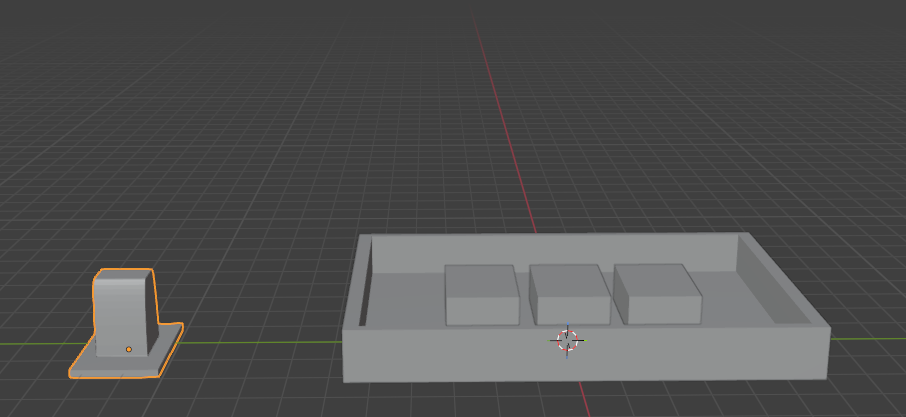
Once the digital model felt right, I moved into the physical world through 3D printing. Seeing the object take shape for the first time was a turning point. It allowed me to test not just the look, but also the feel—how it sat on the wall, how light interacted with its surface, how natural it felt in a real space. Each prototype brought small adjustments, refining both form and function.
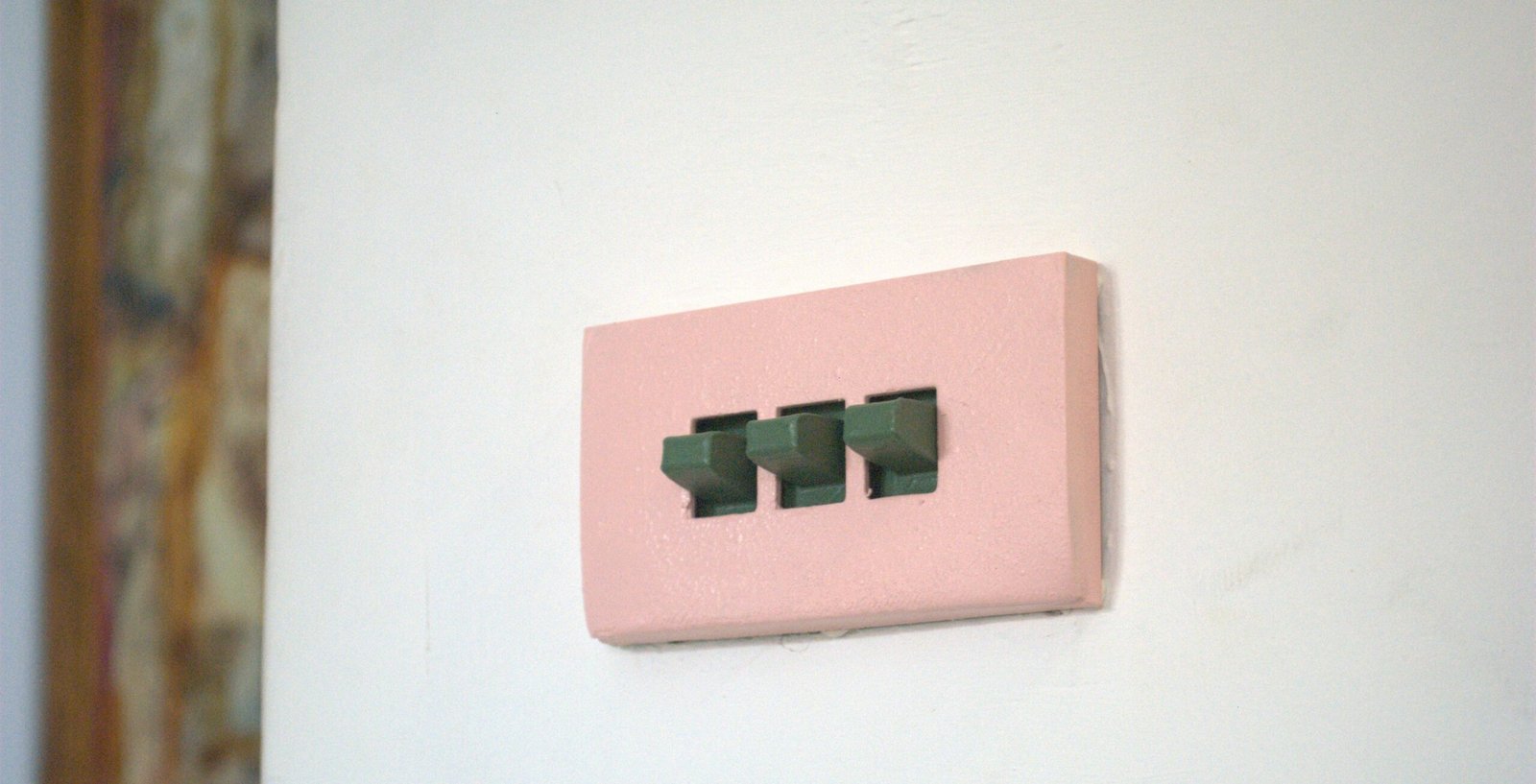
Color became the final layer of expression. Instead of relying on instinct alone, I turned to A Dictionary of Color Combinations Vol. 1, a timeless source of carefully curated palettes. Inspired by its combinations, I experimented with tones that could either blend harmoniously with interiors or stand out as playful accents. Painting the pieces was not just a finishing step, but a way to give each object its own personality.
In the end, this project is about shifting perspective. It’s about noticing the overlooked and asking: what if even the smallest elements in our homes could be designed with intention?
Because sometimes, good design isn’t about adding more—it’s about rethinking what’s already there.